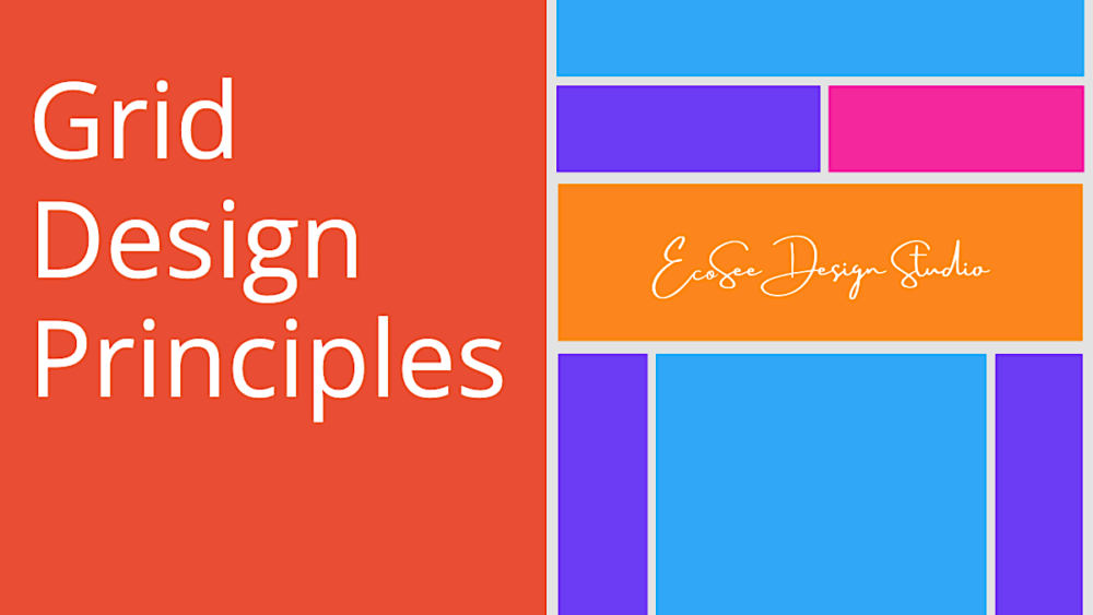
The Anatomy of Web Design
When it comes to grid design, one could write a graduate thesis on all the things to consider and the various ways to achieve these goals. But does it really need to be that complicated? Not if you have the right tools. In this article, I will explore some of the basic things you need to know when designing a website and leave the thesis to college journals. We don’t really need to make it all that complicated.
A grid design approach to building a website simply gives us a framework for laying out our content in a manner that is pleasing to the eye and easy for the potential site visitor or customer to understand. The more complicated the website is, the less sticky it is as a place for gathering information or contracting for services, or converting sales. The average person has an attention span of only a few seconds, so it is imperative that your site be completely intuitive for the end user to navigate. When it comes to grid design, we are mostly talking about rows and columns with a few things like spacing to consider as well.
Rows
It is easy to overlook the importance of rows when designing a website, but it is the first thing I consider when building a site. Each row of content can be further divided into columns and a good page will alternate between the number of columns in various rows displaying each so the information flows cleanly and is easy to digest. When a site is designed skillfully, you won’t even notice that it has rows and columns. The content just flows. You’ve certainly seen rows as the main design principle when viewing a website.
Columns
Within each row of content, you will find a set number of columns. For example, we’ve all seen the website where you land on the homepage to see an image that spans the full width of the page that often has some text laid on top of it and maybe even a call to action button. This section of the website is affectionately called the “hero” section. It is the first impression and it is usually displayed as a single column within the row of content. There may be an overlay of content that is commonly displayed in 1 to 4 columns, but we’ll get back to that in another article about the first impression of a website.
Gutters and Margins
Gutters serve the purpose of creating space and generally refers to the space between columns and rows. There is no need to overthink this as it is the job of the designer to create this spacing, but it is generally important to consider spacing when you design your site. Too little spacing and the content feels cramped and uninviting. The trend these days is to more “negative space” or simply put space without content, then to less space and an attempt to use up every inch of the page. The age of newspapers was the age of using every inch on the page, but the web cries out for spaciousness and makes it easy to accomplish with unlimited scrolling potential.
As for margins, this is generally thought of as the space between the content and the edge of the page. For those who know about margins from the age of HTML and CSS designing, margins are used as a property to create space around a design element. In the context of layout grids, margins refer specifically to the space between the overall layout and the outer edge of the content.
It can be hard to read when content crowds the side of the screen, so we use margins to create some space on the sides so the content flows down the middle of the screen. This is more important to consider when designing for the mobile phone viewer, but it should always be considered since that is exactly how most of your site viewers will see your website these days.
Why grid design matters
Not only does grid design create a site that has an eye-pleasing layout, but it also contributes to mankind the website being responsive so that it looks good on any screen or device. When designing your site, you can often get the best functionality on a bigger screen such as a desktop or laptop screen, but it is also important that the site works well and looks good on tables and especially on phones. More and more people are shopping on their mobile devices whether that is for services or goods and it is imperative that the site works well on these devices. By employing a grid design, we can lay the contact out using percentages of screen width so they respond to the width of the divide your user is on. If the device is small, like a phone, the grid design approach allows you to stack the elements so they look good on the smaller format screen as well.
What do we mean by stacking? In most cases, we can think of the site like we see text on a page. We tend to read from left to right and then from top to bottom. So, we can take the columns that layout left to right on a larger screen and simply stack them from top to bottom so the same content is seen in the same order. That way the content retains its intuitive display of information no matter what kind of device your viewer is on. Grid design not only enables us to control the order the information is displayed, but it also gives us the ability to turn off certain elements or even entire columns once we stack them for the smaller device. For example, maybe we render an image as a space-filling technique on the desktop screen but find that it just pushed relevant information further down the page on the mobile device. We can simply turn that element off based on the screen size and program the website to detect the width of the device it is being viewed in.
Grid design is a powerful tool for reducing the time we spend building websites meant for a variety of screen sizes. We can control the content layout for maximum readability and this maximum conversion or return visitor rates. The artist in us can thrive with grid design and a website is often a work of art after all.


